How to create an on-brand LinkedIn carousel in 60 minutes
You open Canva to “quickly make a carousel”. Thirty minutes later you’re still tweaking a font. Then a color. Then the spacing. You end up with 8 pages that look like they were made by 8 different brands.
That’s not a taste problem. It’s a system problem.
A LinkedIn carousel isn’t design. It’s a script people skim with one thumb
A good carousel behaves like a mini landing page. Nobody sits down to admire your layout. They scroll, pause, and swipe if the promise is obvious and the reading feels effortless.
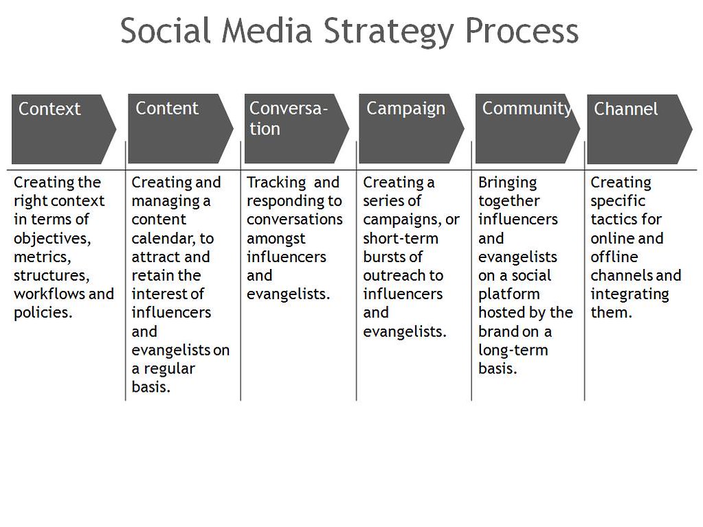
Concrete example: same visual DNA, fast variations across channels.
“Pretty” matters, but less than you think. What matters more: clarity in two seconds.
Simple rule: if page 1 doesn’t work as a tiny preview, the carousel won’t get traction.
Before you touch any design tool, ask one uncomfortable question: what changes for the reader after page 8?
Lock your visual system (or you’ll rebuild it on page 6)
Most hand-made carousels fail the same way: the first three pages feel consistent… then everything drifts. The reason is boring: you keep re-deciding the brand rules while you’re already producing.
You don’t need a 40-page brand book. You need four non-negotiables.
- Two colors: a primary and an accent (not six)
- One headline style: size, weight, casing
- One grid: identical margins everywhere
- One signature element: a corner radius, a line, a badge, a pattern
That’s it.
If you already have a site or landing page, start from what’s already working. Palette does exactly that: you import your brand from a URL, it extracts your visual DNA (colors, vibe, style), then you generate variations that stay consistent.
Useful link: Palette
The win isn’t “AI does design for me”. The win is “I stop renegotiating my brand every time I post”.
The “1 promise, 7 pages, 1 action” structure
When a carousel feels weak, it’s rarely an aesthetics issue. It’s usually structure.
This is a practical spine that works for most B2B topics (SaaS, services, personal brand). It forces you to be specific.
- Page 1 (hook): one sharp sentence. Not a definition.
- Page 2 (situation): what’s happening in real life.
- Page 3 (mistake): what people do, and why it backfires.
- Page 4 (principle): the rule that reframes everything.
- Page 5 (method): three steps max.
- Page 6 (example): apply it to a concrete case.
- Page 7 (check): how to validate it quickly.
- Page 8 (CTA): one simple next move.
Eight pages is intentional. Below that, you don’t have enough room to prove anything. Above that, you start repeating yourself.
A concrete example (if your audience is SaaS founders)
Hook idea: “Your carousel doesn’t need to be beautiful. It needs to be readable.”
Method (page 5) in three steps:
- Write the promise in 12 words
- Write 7 page titles (one idea per page)
- Only then design (on the same grid)
If you’re spending 45 minutes on page 1, you’re optimizing a layout. You’re not publishing.
Produce fast: variations beat perfection
The Canva trap is local perfection. You polish one page for 20 minutes… while the real issue is hierarchy, pacing, or contrast.
A faster approach is to generate two or three options per page, pick one direction, then harmonize across the whole deck.
Palette is built for that kind of production: instead of recycling templates used by thousands of people, you get unique visuals that still look like your brand.
Five rules that prevent most unreadable carousels:
- One sentence per page (two, but short)
- One bold level (otherwise everything screams)
- Aggressive contrast (mobile is unforgiving)
- Huge margins (yes, bigger than you want)
- A rhythm: alternate “headline” pages and “proof” pages
Size and export: keep it boring
LinkedIn carousels are typically uploaded as PDFs. For a clean mobile experience:
- 1080×1350 (vertical) if most of your audience is on mobile
- 1080×1080 if you want a square look
- 8 to 12 pages (start with 8)
No fancy effects needed. Clear background, readable type, logical progression.
Mobile check: the feed tells the truth
The best test is dumb on purpose: open the carousel on your phone, medium brightness, one hand.
If you have to zoom, it’s too dense.
If page 3 doesn’t make you want to swipe, the pacing is wrong.
If page 8 doesn’t give a clear next step, the carousel is unfinished.
Quick validation checklist:
- The hook makes sense without context
- Every page has a title that guides the eye
- Pages 2–3 make the pain feel real
- The method fits in three steps
- The last page asks for an action doable in 30 seconds
One more thing: treat the last page like a button, not a recap. Put the action first (“Download the checklist”, “Copy the framework”), then add a tiny line of context. If the CTA needs a paragraph, it’s not a CTA.
Want to move even faster? Do one iteration only.
- Draft: text + titles, no perfect design.
- Second pass: harmonize and crank contrast.
Then publish.
If you want to turn this into a repeatable workflow: try it free
FAQ
What’s the best number of pages for a LinkedIn carousel?
Start with 8. It’s long enough to prove one idea, short enough to keep momentum. Once you’re comfortable, go to 10–12 for denser topics.
Do I really need to write before I design?
Yes. At least write the page titles first (one idea per page). Otherwise you’ll design text that hasn’t found its structure yet.
How do I stay consistent when I publish two carousels a week?
Reuse a system: the same grid, the same headline style, the same two colors, the same signature element. A brand-consistency tool exists to prevent you from redoing that work every time.
Is Canva enough, or do I need something like Palette?
Canva is enough if you post occasionally and you don’t mind tweaking. Palette becomes useful when you want to publish often, fast, and stay consistent without spending 30 minutes “re-applying” your brand on every visual.
Related reading
Continue reading

How to create 30 brand visuals in one hour with AI
A practical guide to producing 30 brand-consistent visuals in 60 minutes with AI. Tested method, concrete steps, real numbers.
How to create newsletter visuals that actually strengthen your brand
Your newsletters look generic? Learn how to create brand-consistent email visuals in minutes, no designer needed.
Community manager: how to produce 5 visuals a day without losing your mind
The average community manager publishes 21 posts per week. Here's how to cut visual creation time by 90% with AI.